___
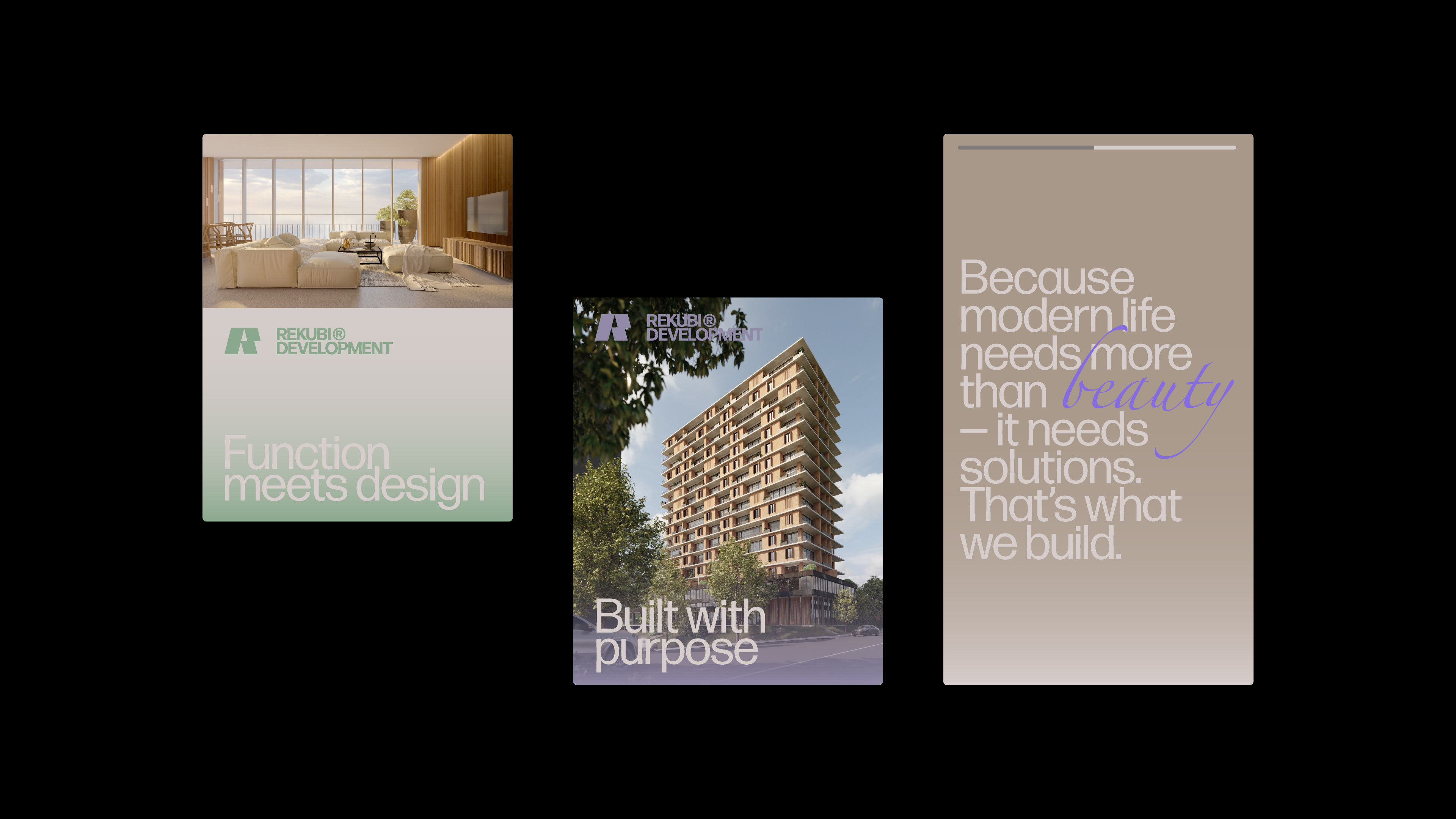
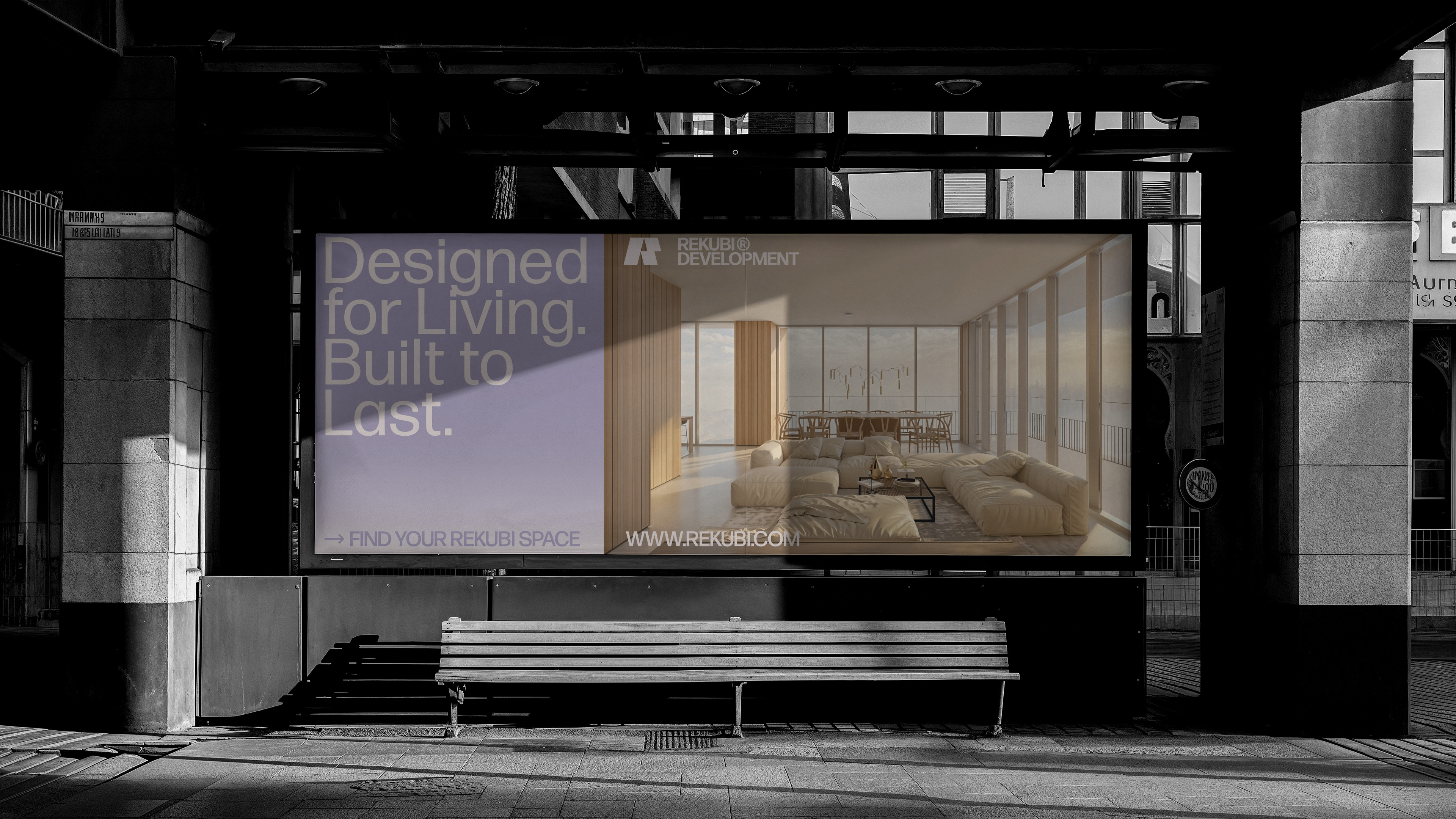
Rekubi Development was established to address a distinct gap in the development industry: the need to design with the urban interests of residents and cities in mind. While many companies prioritize expansion, Rekubi focuses on the human experience of space — shaping environments that are intuitive, functional, and meaningful.
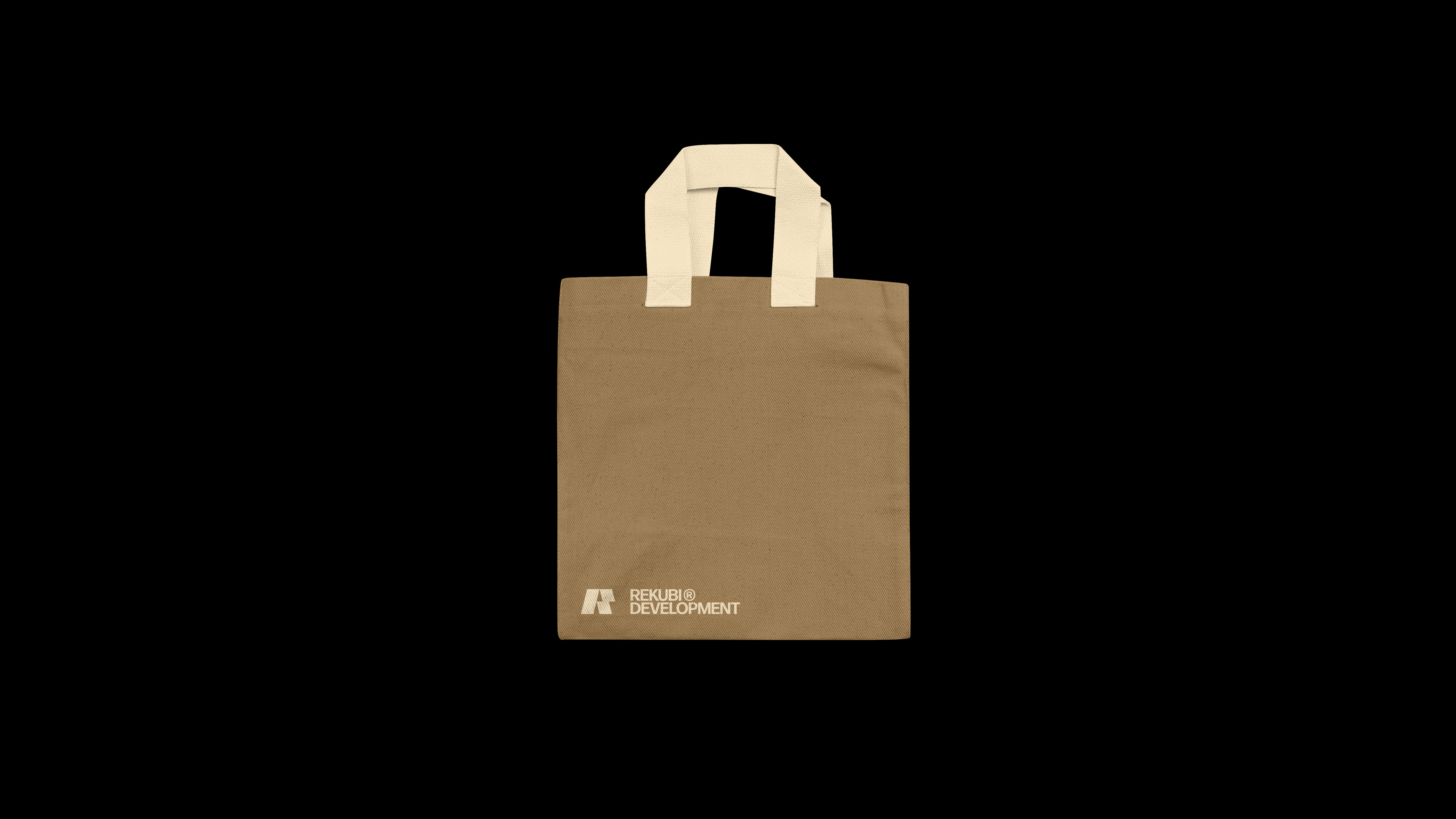
The visual identity centers around a bold, slanted "R" lettermark, symbolizing both forward momentum and structural integrity. Paired with a strong, modern wordmark, the brand communicates reliability, purpose, and contemporary design sensibility.
The overall system reflects the company's core values — precision, strength, and a deep understanding of how thoughtful development can elevate everyday life.
This branding direction positions Rekubi as a modern, people-focused developer that builds not only with intention, but with vision.